Client
Year
Uno-X Mobility
2023 / 2024
Delivery
Design
Photography
Film production
Strategy
Concept
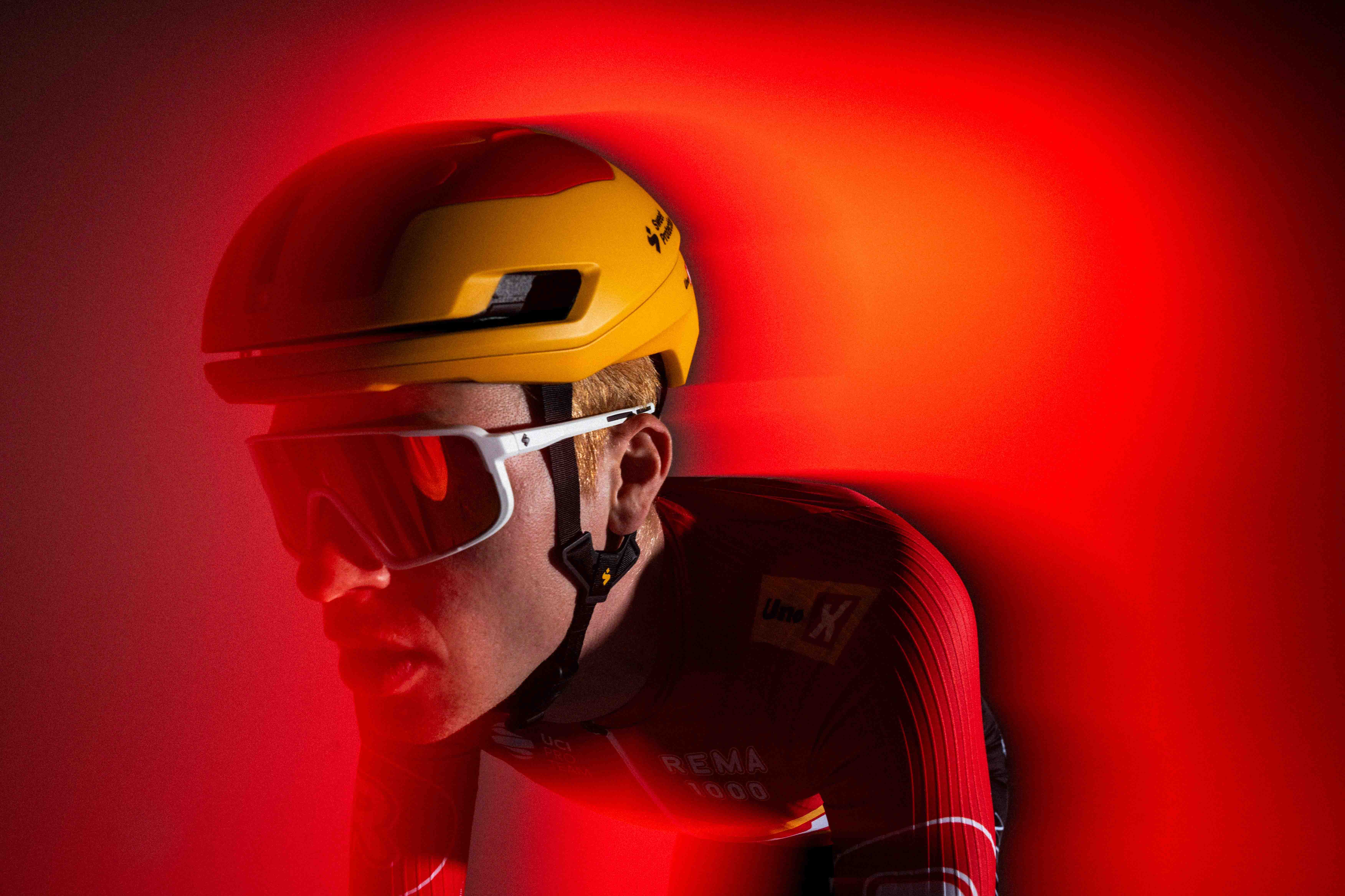
This season, we have aimed to create a powerful identity that takes ownership of Uno-X's colours. Yellow and red are combined and balanced to create a visual expression that stands out and can thrive on digital platforms throughout a long cycling season. By using the images as a clear visual style, it sets the standard for how the expression should be. With this, we have been able to design and produce content with a distinct red and yellow thread.


Start lists for each race are published on Twitter and Instagram, and with over 150 races a year, this is an important design element.


Over the past few years we have worked closely with Uno-X to develop the creative strategy and development of the team's visual profile. Our focus has been to build a consistent and powerful identity that reflects the team's values and ambitions. By continuously developing the expression, we have ensured that both the use of color and visual style stand strong in the face of the cycling world.


